Introduction
In a previous post I investigated the wins of an NBA team over the course of a season. I used calendar heat maps to see if there were any interesting features or types of seasons. I want to look at wins over a season on a more micro level though. How did the win occur, was it a come from behind victory, a shootout or a blowout? I spent some time thinking about this and realized I could compare the actual time series of points over a given game to see how a particular win looked. I next needed some machinery to work with a lot of these time series objects, normal methods of comparisons start to break down due to the curse of dimensionality. I remembered a Tech Talk we had at work from a couple of years back about a method that achieves this, Symbolic Aggregate approXimation (SAX). The talk was given by one of the SAX creators, Jessica Lin from the George Mason University.
I wrote some code to implement this methodology. There seems to be a few versions out there but I really like to see how things work and the best way I have found to do this is to create them myself. You can find a copy of this code here, which is better documented than the code contained in this post as it is setup to create help files.
You can also run it remotely by executing the following.
devtools::source_url('https://raw.githubusercontent.com/darrkj/gh-pages/blog/july252014/R/sax.R')It may be more enlightening to walk through what SAX does and the actual code though.
The first function constructed is breakPoints. In order to to create the symbolic representation of the time series we need regions to assign tokens. These are the points that break the values of the time series that produce equal sized areas under the Gaussian curve. This function takes a value, n, which is the number of regions that you desire, also the number of distinct tokens in your symbolic alphabet. If you want 4 regions you will get a result of 3 values that create these cutoffs. If this seems odd to not give it 3 have a look at the fence post problem.
breakPoints <- function(n) {
  if (n < 2) stop("Input must be greater than one!")
  if (n > 26) stop("There are only 26 letters!")
  # Create uniform splits from 0 to 1, take all but first.
  x <- seq(0, 1, length.out = (n + 1))[-1]
  # Find the point which that has the above in area undeer CDF.
  return(qnorm(x)[1:(n - 1)])
}

breakPoints(4)
## [1] -0.6745 0.0000 0.6745The next function to be constructed is the piecewise aggregate approximation. This is actually a more common calculation used in lots of other types of analysis. You basically take a span from a time series and represent that period by some aggregate over the span, here we use the mean. This function condenses a span of time from a given time series into the mean over that span of time. The result is a sequence that contains only n observations. This function has three arguments, but only one of p or n are required.
- sts - The time series to condense
- n - The number of piecewise sections to generate
- p - Number of point in one aggregation, opposes n
paa <- function(sts, n = 10, p = NA) {
  # Create a sequence of 1 to length of series.
  l <- seq_along(sts)
  # This will find the number of obs in order to have n groups.
  grp <- length(l) / n
  # This creates an index for the ts of which group the obs belongs to.
  fac <- floor((l / grp) - .0001)
  # Allow mechanism for creating a period like week, 3 days.
  if (!is.na(p)) fac = rep(0:(length(sts) / p), each = p)[l]
  # Split the original ts into these groups.
  pa <- split(sts, fac)
  # Find the mean for each group.
  return(unlist(lapply(pa, mean)))
}

require(zoo)
x.Date <- as.Date("2003-02-01") + 0:5
x <- zoo(rnorm(6), x.Date)
paa(x, 2)
## 0 1
## -0.6455 0.6416all(c(mean(x[1:3]), mean(x[4:6])) == paa(x, 2))## [1] TRUENow we are starting to get to the meat of the methodology. We need to tokenize the piecewise aggregated approximate representation. We construct the token function to tokenize the PAA of a time series. This results with a sequence of strings as opposed to the aggregates.
token <- function(sts, bp = 3) {
  # Call to get the breakpoints.
  bp <- breakPoints(bp)
  # Turn to numeric vector, faster and easier to work with.
  sts <- as.numeric(sts)
  # Initialize the word to nothing.
  word <- NULL
  # Set first for values under first threshold.
  word[sts < bp[1]] <-  letters[1]
  # Loop throught the rest.
  for(i in seq(bp)) {
    # If they are greater than breakpoint replace.
    word[sts >= bp[i]] <- letters[i + 1]
  }
  return(word)
}


x.Date <- as.Date("2003-02-01") + 0:5
x <- zoo(rnorm(6), x.Date)
token(paa(x, 2), 3)
## [1] "c" "b"Now the central function, SAX. This function process the time series to the Gaussian representation, runs the piecewise aggregate approximation and tokenizes the result.
sax <- function(ts, bp = 3, n = 10, plot = FALSE, p = NA) {
  # This allows for plots to work, kludge.
  index(ts) <- 1:length(ts)
  # Normalize the incoming time series.
  ts <- scale(ts)
  # Create the piecewise aggregates.
  x <- paa(ts, n, p)
  if (plot) {
    # Create plot of normalized time series.
    plot(ts)
    points(rep(x, each = (length(ts) / n) + 1))[1:length(ts)]
    for(i in breakPoints(bp)) {
      lines(1:length(ts), rep(i, length(ts)))
    }
  }
  tokenTS <- token(x, bp)
  comment(tokenTS) <- as.character(bp)
  return(tokenTS)
}

x.Date <- as.Date("2003-02-01") + 0:99
x <- zoo(rnorm(100), x.Date)
sax(x)
## [1] "c" "b" "a" "b" "b" "c" "a" "b" "c" "b"sax(x, plot = TRUE)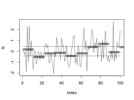
## [1] "c" "b" "a" "b" "b" "c" "a" "b" "c" "b"We now have the ability to tokenize a time series. To do anything useful with this though we need to be able to compute the distance between these tokenized strings. First we have to create a lookup table.
# Lookup table.
lookUp <- function(x) {
  # Call to get the breakpoints.
  d <- breakPoints(x)
  # Initialize matrix of zeros.
  distM <- matrix(0, nrow = x, ncol = x)
  # Loop over each row and column.
  for(i in seq(x)) {
    for(j in seq(x)) {
      # Check to make sure its greater than one.
      if(abs(i - j) > 1) {
        # This comes from the paper for how it is created.
        distM[i, j] <- d[max(i, j) - 1] - d[min(i, j)]
      }
    }
  }
  return(distM)
}


distSAX <- function(x, y) {
  lx <- as.numeric(comment(x))
  ly <- as.numeric(comment(y))
  #if (lx != ly) stop("Time Series were not tokenized the same")
  xx <- NULL
  lk <- lookUp(lx)
  for(i in seq_along(x)) {
    a <- which(letters %in% x[i])
    b <- which(letters %in% y[i])
    xx <- c(xx, lk[a, b] ^ 2)
  }
  return(sqrt(sum(xx)))
}
Now we have everything we need to use this for some practical purpose.
Getting Setup
First set things up.
require(XML)
require(plyr)
require(devtools)

devtools::source_url('https://raw.githubusercontent.com/darrkj/gh-pages/analysis/MicroWins/R/game.R')
We need to get data. This will get data from the 2013 season. This is all games from that season.
season <- seasonify(2013)
head(season[, 1:5])
## away home date as hs
## 72 Boston Celtics Miami Heat 2012-10-30 107 120
## 269 Dallas Mavericks Los Angeles Lakers 2012-10-30 99 91
## 1303 Washington Wizards Cleveland Cavaliers 2012-10-30 84 94
## 294 Dallas Mavericks Utah Jazz 2012-10-31 94 113
## 335 Denver Nuggets Philadelphia 76ers 2012-10-31 75 84
## 406 Golden State Warriors Phoenix Suns 2012-10-31 87 85Now we get the play by play data.
# Init list
gameObj <- list()
len <- nrow(season)

for (i in 1:len) {
  print(i / len)
  gameObj[[i]] <- play_by_play(season[i, ])
}
If we look at this data it does not appear to be in a form that we can readily use the SAX functionality on.
head(gameObj[[1]][, -2])## time points score q team t2
## 3 12:00.0 NA 0-0 1 <NA> 0
## 4 11:48.0 NA 0-0 1 Boston Celtics 12
## 5 11:47.0 NA 0-0 1 Boston Celtics 13
## 6 11:42.0 NA 0-0 1 Boston Celtics 18
## 7 11:40.0 NA 0-0 1 Miami Heat 20
## 8 11:26.0 3 0-3 1 Miami Heat 34We need to turn the play by play into a time series of the score differential. Along with the code to scrape the data there is a function to process each game into this format.
deltaTS <- llply(gameObj, gameScoreTS)Once this has been cleaned we can see that data looks as we would expect, a time in seconds associated with value of the difference in score. One thing to note here is that this will always be the winning team’s score minus the losing team’s score.
head(deltaTS[[1]])## time diff
## 1 1 0
## 2 2 0
## 3 3 0
## 4 4 0
## 5 5 0
## 6 6 0We can now apply SAX to every game’s time series. A little bit exploration was used to determine the number of breakpoints and regions to aggregate upon. These values seemed to work and I assume that this is a mixture of art and science as to picking these.
gameSAX <- lapply(deltaTS, function(x) sax(zoo(x$diff, x$time), 7, 25))This looks like the strings we would expect to come out of the SAX implementation.
gameSAX[[1]]## [1] "b" "a" "a" "a" "b" "b" "d" "d" "c" "b" "c" "c" "e" "f" "d" "e" "e"
## [18] "f" "g" "g" "g" "g" "g" "e" "d"It has taken a lot of work just to get to this point. The purpose here was to compare wins. In order to compare anything we have to have distances. This was the purpose of the distSAX function created above. We need to create a distance matrix that has the distance from every game to every other game.
len <- length(gameSAX)
gameDist <- matrix(len * len, len, len)

for (i in 1:(length(gameSAX)-1)) {
  for (j in (i+1):length(gameSAX)) {
    tmp <- distSAX(gameSAX[[i]], gameSAX[[j]])
    gameDist[i, j] <- tmp
    gameDist[j, i] <- tmp
  }
  gameDist[i, i] <- 0
  print(i)
}
To show how this works I am going to plot some games along with there closest match in green and least similar game in red.
plotGame <- function(game) {
  idx <- order(gameDist[, game])
  idx <- setdiff(idx, game)

  a <- deltaTS[[game]]
  b <- deltaTS[[idx[1]]]
  c <- deltaTS[[idx[length(idx)]]]
  max <- max(sapply(list(a, b, c), function(x) max(x$diff)))
  min <- min(sapply(list(a, b, c), function(x) min(x$diff)))

  print(season[game, 1:5])
  par(mfrow = c(1, 1))
  plot(a, type = 'l', ylim = c(min, max))
  lines(b, col = 'green')
  lines(c, col = 'red')
}
I can’s say that these are completely random but they are also not just cherry picked. The results look pretty good from a visual perspective. Some looked worse that this but a majority look just as good.
plotGame(79)## away home date as hs
## 1267 Utah Jazz Denver Nuggets 2012-11-09 84 104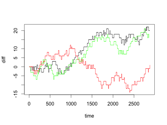
plotGame(86)## away home date as hs
## 1054 Phoenix Suns Utah Jazz 2012-11-10 81 94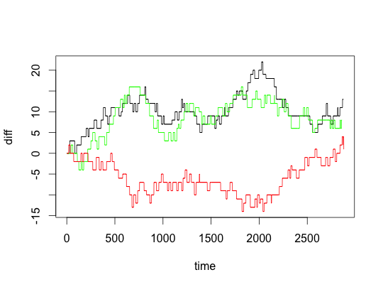
plotGame(95)## away home date as hs
## 78 Boston Celtics Chicago Bulls 2012-11-12 101 95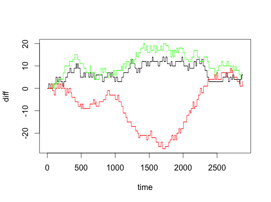
Conclusion
I really wanted to see if there were types of wins, which I still want to do, but I sense that this post is getting a bit long. It will take more effort to devise a method to cluster and validate the results so this stands as a jumping off point. Most of the work is done and the goal seems to be in sight but just out of reach here.