I think it would be interesting to see how an NBA season looks for a given team from a higher level. Can we look down on a season and see slumps, can we see momentum start to build? Again you can see from some of my past posts, with any question we need data.
Getting setup
I have created some code, I don't know if I would call it an API as it needs much more work, to pull seasons of NBA data. You simply give it a year and it will pull all data related to that season. I have some stuff that will pull box scores and play-by-play but it is not really production ready yet. I am also interested in creating a dataset that is persisted on the web but this method works for now. The code exists in the form of a Gist, having devtools installed and loaded you can run the gist as follows.
library(devtools)
source_gist(8634787)
Getting and yes, cleaning the data
Now you can create the data, assuming there are no package issues which I assume you can resolve. Lets pull a recent year. Call the seasonify function with a year, the season will be the year that the championship game took place, not the year the season started. The methods used to pull the data were done in a way to satisfy a few types of questions I was interested in looking at so a little cleaning needs to be done.
# Get one season of data
season <- seasonify(2012)

# The uniques teams in the season
team <- unique(c(season$away, season$home))

# Break apart into two sets, since each game has two teams.
home <- season[, c("date", "home", "hs", "as")]
away <- season[, c("date", "away", "as", "hs")]

# Give them a consistent name.
names(home)[2] <- "team"
names(away)[2] <- "team"

# Create the margin varaible
home$margin <- home$hs - away$as
away$margin <- away$as - home$hs

# Append the data together.
scores <- rbind(home, away)

# Pull the scores realted to each team into a list tied to the given team
final <- lapply(team, function(x) scores[scores$team == x, c("date", "margin")])
names(final) <- team

# The manipulate tol doesn't work in this situation so you need to uncomment
# it for your own use.  manipulate(cal.heatMap(final[[type]], 'margin'),
# type = picker(as.list(team)))
And the outcome
This makes a simple interactive gui in manipulate that you can play with. If you have never played with the manipulate package before it is very easy to wrap your function with a few hooks to make it interactive. You can add any combination of sliders, drop-downs and radio buttons. It comes with RStudio and it seems to have remained stable since it came out a few years ago. This may sound like a bad thing but it isn't, simple interfaces you built two years ago will still work even if you have updated RStudio. It is also like sliced bread, it is great for making sandwiches, it does not need an update. Any changes would over complicate its ease of use.
The bad part is that it is hard to demonstrate in the browser. This portion of code has been commented out. You can uncomment it an play with the drop-down to see various teams. No worries though, I created a few standalone plots from the same codebase to show the results.
cal.heatMap(final[["Chicago Bulls"]], "margin")
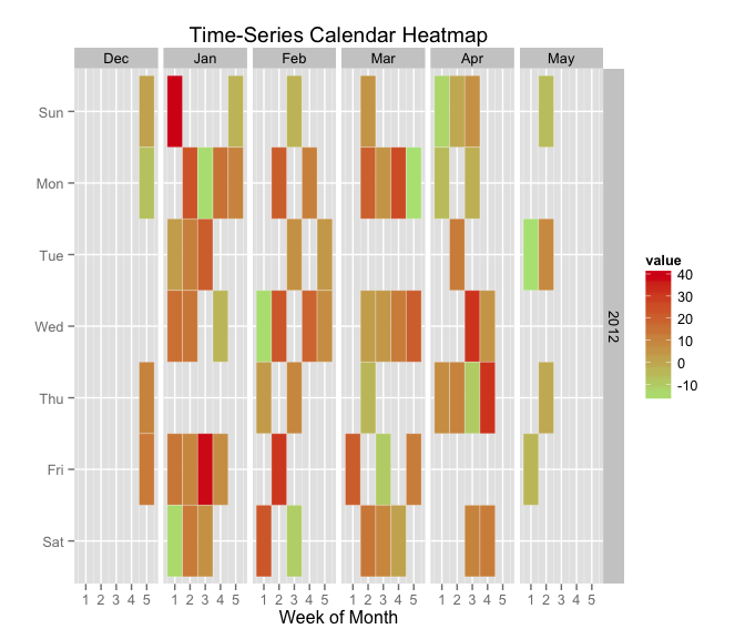
One interesting note here, the Bulls seem to have a lop sided margin they win by more that they lose. This would seem to indicate that they were a good team that year. The other thing to note is that there is a lot of orange meaning it's hard to tell whether they won or lost in all but the most extreme cases, like winning by 40. Thus it is hard to determine whether they are actually good team as far as wins and losses are concerned.
We can change this to show wins and losses opposed to the margin of victory.
# Binary win loss

final2 <- lapply(final, function(x) data.frame(date = x$date, win = ifelse(x$margin >
    0, 1, -1)))
cal.heatMap(final2[["Chicago Bulls"]], "win")
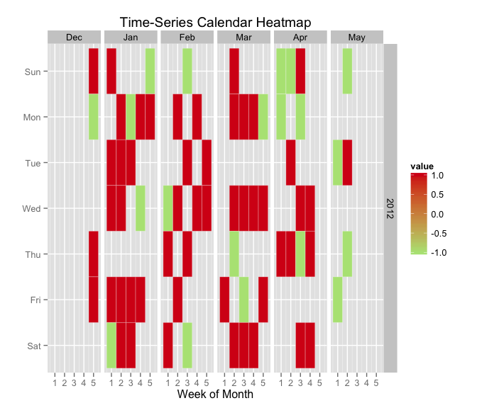
This tells a lot more of the story, in the case of the 2011-2012 Chicago Bulls, they were always on top.
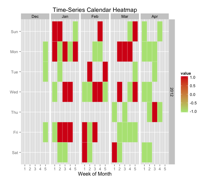
We can see what I set out to resolve, the Timberwolves practically fell apart in April winning only one game.
cal.heatMap(final2[["Minnesota Timberwolves"]], "win")
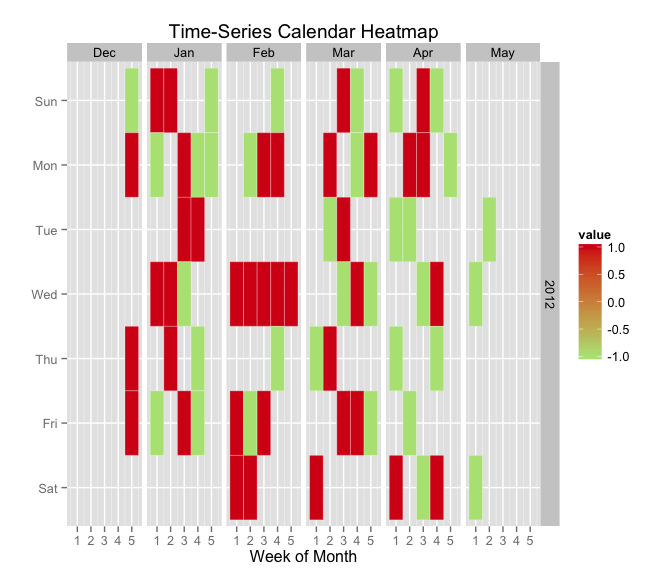
The Orlando Magic seemed to fall apart towards the end as well.
cal.heatMap(final2[["Orlando Magic"]], "win")
In hindsight since the calendar heat map aspect did not pan out so well there may be better ways to visualize this data. I do like that this demonstrates a fairly consistent aspect of any data science endeavour, to answer the question you started with you often have to change paths as you get further in. Data Science is dynamic, letting the data tell you what works and what doesn't will get you much farther. It also helps to have code and data that lets you change paths easily.
Future
I think it would be cool given data over more years to be able to pick seasons and also be able to compare teams or even look over teams for multiple years. That is starting to get away from the simple nature of manipulate and move more towards shiny or d3, which I may think of converting this into.