Anomalies vs Outliers
Anomaly detection, or finding needles in a haystack, is an important tool in data exploration and unsupervised analytic modeling. Anomaly detection also creates a path to supervised modeling by singling out key examples that an analyst can begin to classify as needles or hay. Those labeled examples are essential for supervised learning, which is much more powerful than unsupervised learning methods like clustering.
Though anomaly and outlier are often used interchangeably we’d like to emphasize distinct definitions. As Ravi Parikh describes well in a blog post[1], “An outlier is a legitimate data point that’s far away from the mean or median in a distribution. It may be unusual, like a 9.6-second 100-meter dash, but still within the realm of reality. An anomaly is an illegitimate data point that’s generated by a different process than whatever generated the rest of the data.” For a simple example, imagine a data set containing attributes of dogs. There will be outliers in size, color, eye color, and many other attributes. But if several of the records actually represent cats, those records are anomalies. Applying this analogy to contract records, the “cat-like” contracts may be a fraud risk.
Many attributes for the cat records will look a lot like some dogs in size, color, eye color, etc. The cats can still be hidden within the pack of dogs when single attributes are independently analyzed. The same applies to contract fraud. The motivation of this article is to review a number of methods (one very new) to detect potential anomalies by finding records whose collection of attributes are in some way different than other records. In our analogy, the cats are within the dogs’ bounds of size, but when all of the attributes are considered simultaneously, the cats reveal themselves as anomalies.
In practice, it usually takes domain knowledge to discern between outliers and anomalies, but the techniques discussed here are useful for identifying unusual cases in higher dimensional spaces worthy of attention. They winnow the hay down to a smaller pile that has a higher likelihood of containing real needles.
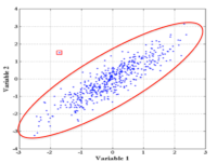
Figure 1 shows a simple example of a point that is not an outlier in either 1-dimensional distribution, but is an outlier in the 2-d scatterplot – the joint probability distribution of Variables 1 and 2.
Because they are odd and can be pesky creatures (like cats!), anomalies are sometimes written off as mistakes or problems in measurement. The Antarctic Ozone Hole was “discovered” in 1985 yet there were indications of its presence as early as 1981. Scientists initially dismissed the outlying measurements, assuming that the radiation detection sensors were faulty. Data scientists though, realize that our best days coincide with discovery of truly odd features in the data.
5 Methods
Following are five powerful ways to detect outliers in multiple dimensions.
Mahalanobis Distance
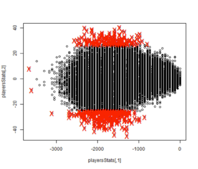
 The Mahalanobis Distance is a descriptive statistic that provides a measure of a data point’s relative distance from a central location (see Rick Wicklin ‘s site). It calulates distances along the principal components and therefore takes into account attribute co-variances. This means the measurement is unitless and scale-invariant, so we can compare measures across data sets. Figure 2 an example of a a Mahalanobis boundary plotted on the joint probability shown earlier.
The Mahalanobis metric corrects for scale and correlation in calculating distances, and it works especially well at identifying outliers when the attributes have numeric data elements with normal-like distributions.
CADE
Dr. David Jenson, along with Lisa Friedland and Amanda Gentzel have devised a new method called CADE, Classifier Adjusted Density Estimation that seem very promising. It appends to the original data a new (fake) data set where every variable has values drawn from a uniform distribution of the original dataset’s possible values. A new target variable, anomaly, is created and every case in the random data gets an anomaly label of 1. In the real data the target value is 0. A classification algorithm is trained to predict the anomaly variable on the combined sets of real and made-up data. Finally, the original data is scored using the model. The resulting prediction for each record estimates its probability of being an outlier.
Local Outlier Factor
Local Outlier Factor is an algorithm for identifying density-based local outliers [2]. An observation is classified as an outlier, relative to its neighbors, if its local density is significantly smaller than its neighbors’ local densities. To measure density, one must select a distance metric (see Mahalnobis for a good one), and then each point looks at its K-Nearest Neighbors, and from them determines its reachabilty distance. A density is then calculated using all points that fall with this distance. Each point’s density is then compared to those around it, and the “loneliest” points are called outliers. This technique requires numeric data and may be less effective in higher dimensions.
Box and Whiskers
The oldest method we discuss here – the box plot – was created by John W. Tukey. This graphical way of visualizing outliers is only effective in very low dimensions. Although most commonly used as a visualization technique, measurements more than one and a half times outside the interquartile range in multiple dimensions can be considered an outlier. However, covariance is not considered hindering interpretability in higher dimensions. An example of how it would label anomalies can be seen in the image below.
K-Means
The K-means algorithm partitions the data into K groups by assigning them to the closest cluster centers. Given a positive integer K and a test observation, the KNN classifier first identifies the K points in the training data that are closest to the test observation. It then estimates the conditional probability for each class as the fraction of points whose response values equal that class. Finally, KNN applies Bayes rule and classifies the test observation to the class with the largest probability. For example, if K were assigned the value of 1, then x0 would be assigned the class of the closest known point to the test observation. This produces the most over-fit model that does not generalize well. On the other extreme, as values of K get very high, the classifier becomes linear. In practice, K is typically assigned a value between 5 and 10.
Once observations have been classified (assigned a class), then measure the distance between each of the observations and its cluster center, and pick those with the largest distances as outliers[3].
An interesting experiment
One way to test these methods is see how they stack up against each other using some real data. We chose a fun challenge of using player statistics to identify NBA stars. Clearly, some players are better than others. But some are so far ahead of the pack they get labeled as “All Stars.” We can use each of the methods to pick the All Star players by identifying those who are (positive) anomalies based on their in-game statistics.
The data for this experiment comes from the 2013 NBA regular season. Each technique above required its own type of cleansing and preprocessing. Because each method has its own set of assumptions and limitations, not all data elements could be used with every one. For instance, some methods can only operate on numeric data. Kenny Darrell (Elder Research, Inc.) and former NBA player Ruben Boumtje (graduate student at Georgetown University) gathered the statistics and then applied all five techniques to the resulting data. The following Figure represents the overlap between identified All Stars for each of the five methods.
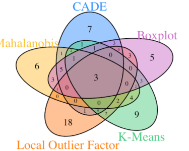
The good news is that it appears there is a fair amount of overlap (agreement) between the methods. The three players in the center (Kevin Durant, LeBron James and Paul George) would probably be considered some of the top All Stars in the league – although there is always room for spirited debate about that. The more interesting finding in the experiment is the diversity of outliers found by the different methods. While the strongest anomalies in the multi-dimensional space are consistently identified, subtler differences are found in the transition space between what might be considered “outlier” vs “strong outlier”. Profiling the results of each technique separately may reveal differing characteristics of the statistics that push players towards the anomalous category.
A great place to start
Anomaly detection is a great place to start analysis when there is not a clear or available outcome (target variable) for your model. Anomalies represent odd records in the data that many times lead to new questions and discoveries. There is not a single best technique to recommend for all the world’s data. Learn how to apply all of these techniques to your data and open up a new avenue for discovery.
1) http://data.heapanalytics.com/garbage-in-garbage-out-how-anomalies-can-wreck-your-data/
2) LOF: Identifying Density-Based Local Outliers (2000), Markus Breunig , Hans-Peter Kriegel , Raymond T. Ng , Jörg Sander.
3) http://cran.r-project.org/doc/contrib/Zhao_R_and_data_mining.pdf#page=76