Elo is a method used to rank players in head to head competitions. It can give a sense of the difference in skill level between two players.
Background
Given some history of head to head competition data Elo attempts to answer the following questions; what is the skill level of various competitors and what is the probability that a given competitor will win over another. It allows us to answer all sorts of interesting questions, most interesting of which is given two opponents who have never faced off and perhaps share no common opponents and even from different periods who is most likely to win. For instance who would win in a bout between Mike Tyson and Muhammad Ali. People have already tried to determine the winner, example here, but this seems rather subjective. It also has a lot of bias since both of there careers are over. With recency bias we look at the totality of their career. We may actually want both of them in the prime of their career. With Elo, and other similar methods, we can do these sorts of things. Say a match did occur, were both competitors in their prime, would it be a different outcome at different points in each’s career? Elo is not perfect but it is far more objective than using things such as opinions. It allows us to see the competitor’s rise and fall. I am in no way saying it is perfect though. It has many issues such as the cold start problem. It handles this by defaulting to a base value which means we should have little confidence in this observations. I want to try to see what other issues it has and how well it works as well as just get an understanding of the domain
There are a few packages in R, here and here, that provide the functionality to run Elo. To really understand Elo though I decided to implement it myself.
The first thing that is needed is some assumptions on what the data will look like. The data under investigation will require a few things. The first thing is some form of unique identifier for both players. We also need the outcome of the match. I chose to use chess as the base for describing the structure. The structure of this should be the id for white, the id for black and the outcome or score from white’s perspective The score field is assumed to be 0, .5 or 1 for lose, draw and win. If the domain differs from chess we can have a natural mapping, in baseball and most other team sports we can say that the home team is white, in things such as Boxing or MMA we can say a particular corner is white, and there should be a similar analogy to other domains, otherwise just assign a side at random.
Implementation
The function I constructed takes a dataset as described above. It also takes a parameter called ratings, which is a data.frame that contains the id and rating for players. The id should be the fields in the white and black fields, if there are id’s that have not been seen they will get a default value, some ratings may not be needed. The mx parameter is the initial value if the player id has never been seen, they are a rookie with no history. The k parameter, often called the K-factor, is a parameter used in Elo to determine the maximum adjustment per match. This code also comes from a bunch of attempts, many details were learned through odd bugs, but I won’t discuss all of them in detail.
library(dplyr)
library(ggplot2)

elo_int <- function(data, ratings, k = 16, mx = 400) {
  # Function to initialize the rating for a new player.
  . %>% ifelse(is.na(.), mx, .) -> new_rate

  # The first step is to add ratings onto each side.
  data %>%
    left_join(ratings, by = c('white' = 'id')) %>% rename(w_rate = rating) %>%
    left_join(ratings, by = c('black' = 'id')) %>% rename(b_rate = rating) %>%
    # Now impute the rating when it does not exist.
    mutate(new = is.na(w_rate) | is.na(b_rate)) %>%
    mutate(w_rate = new_rate(w_rate), b_rate = new_rate(b_rate)) %>%
    # This is the equation to calculate new ratings.
    mutate(e = 1 / (1 + 10 ^ ((b_rate - w_rate) / 400))) -> data

  # Get the expected score for every match from both sides.
  data %>% select(id = white, rate = w_rate, score, e) -> white
  data %>% select(id = black, rate = b_rate, score, e) %>%
    mutate(score = 1 - score, e = 1 - e) -> black

  # This will calculate the new elo rating for each player.
  rbind(white, black) %>%
    group_by(id) %>%
    mutate(rating = mean(rate) + k * (sum(score) - sum(e))) %>%
    select(id, rating) %>%
    distinct %>%
    ungroup %>%
    arrange(desc(rating)) -> new_rating

  data %>% mutate(p = b_rate - w_rate) %>% select(score, p, new) -> data

  list(data = data, new_rating = new_rating)
}
This function will return two things: the new rating for each player and a data frame with the outcome of the match with the differential and whether or not one of the players was new thus have a default value. Another thing to note here is that if multiple matches are present then the updated score will reflect each of these matches in aggregate.
Example
Here is a small dataset that will shed some light on what is happening.
data <- data.frame(white = c(1, 3, 5, 7, 9, 11), black = c(2, 4, 6, 8, 10, 12), score = c(1, 1, 1, 1, 0, 1))

rate <- data.frame(id = 1:10, rating = c(400, 400, 500, 400, 400, 500, 800, 400, 1800, 400))

elo_int(data, rate)
## $data
## score p new
## 1 1 0 FALSE
## 2 1 -100 FALSE
## 3 1 100 FALSE
## 4 1 -400 FALSE
## 5 0 -1400 FALSE
## 6 1 0 TRUE
##
## $new_rating
## Source: local data frame [12 x 2]
##
## id rating
## 1 9 1784.0051
## 2 7 801.4545
## 3 3 505.7590
## 4 6 489.7590
## 5 10 415.9949
## 6 5 410.2410
## 7 1 408.0000
## 8 11 408.0000
## 9 8 398.5455
## 10 4 394.2410
## 11 2 392.0000
## 12 12 392.0000This small example tries to provide a few cases of interest. We have a set of matches and the rating for each of the competitors involved.
Equal Ratings
The first match is even 400-400. The winner jumps up to roughly 408 and the loser down to 392. Thus we can see an 8 point adjustment per player, a total of 16 which is half of the total possible change. We can see how players move as they have more matches, over time converging to their real skill level, or trailing them if they are rising or falling.
Small Advantage - Expected Outcome
The next match has a 500-400, the higher ranked player wins, but he gets a much smaller bump because this was the more likely event.
Small Advantage, Unexpected Outcome
The next match has a 400-500 but here the higher ranked player loses. The shifts here are almost twice that of the last match and in the opposite direction. This is because the outcome was much less expected. It shows that if players are rated incorrectly the issue should resolve itself as they play more.
Large Advantage, Expected Outcome
The next match has a 800-400 setup, a much larger difference. The higher rated player wins and there is very little change. This shows that the shifts are related to the difference. It also tries to make it hard for a good player to play a lot of matches against lower players to increase their rating, something common to many other types of ranking systems.
Large Advantage, Unexpected Outcome
We have another case where there is a much larger difference in rankings, but the higher ranking player loses. Here we see roughly the maximum adjustment applied to both players.
Cold Start
The last case shows how it handles the cold start problem. We can have a value to initialize players, over time they should move to their correct rating.
Rolling Through Time
If we have lots of matches that span a large period of time we don't want to aggregate them. We need some sort of wrapper to run this over time. This way we can see a players history. The next function will handle this. It can take some form of initial ratings and also some method to denote how to step through time. This function takes a list of all of the matches, this dataset is similar to the above data except that it expects a field that displays some form of temporal element, really anything that can be ordered. The default rating is null, meaning you do not have ratings for any of the players. The verbose options simply displays an output after each step in time. The complete argument is meant to return the rating for each player at every point in time instead of just the places where we see them competing.
elo_loop <- function(data, rate = NULL, period = 'month',  verbose = F, complete = F, ...) {
  if (is.null(rate)) {
    rate <- data.frame(id = numeric(), rating = numeric(), per = numeric())
  }
  stat <- data.frame(score = numeric(), p = numeric(), per = numeric())
  for (i in sort(unique(data[, period]))) {
    month <- data[data[, period] == i, ]
    rates <- rate[rev(!duplicated(rev(rate$id))), ]

    tmp <- elo_int(month, rates, ...)
    if (nrow(tmp[[2]]) > 0) {
      rate <- rbind(rate, data.frame(tmp[[2]], per = i))
    }
    if (complete == TRUE) {
      old <- anti_join(rate[rate$per == i-1, ],
                       tmp$new_rating, by = 'id')
      if (nrow(old) == 0) {
        rate <- rbind(rate, data.frame(old))
      } else {
        rate <- rbind(rate, data.frame(old[, 1:2], per = i))
      }
    }
    stat <- rbind(stat, data.frame(tmp[[1]], per = i))
    if(verbose) print(i)
  }

  stat$prob <- 1 / (1 + 10 ^ (stat$p / 400))
  stat$d <- -round(stat$p)
  stat <- stat[order(stat$p), ]
  list(stat = stat, rate = rate)
}
Here player one has no rating to start, he plays a different rated player each month. These players are better than the 400 default as well. They range from 500 to 1000. Our new player wins every match so he must be pretty good. This new function allows us to watch his climb.
data <- data.frame(white = 1, black = 2:10, score = rep(1, 9), month = 1:9)
rate <- data.frame(id = 2:10, rating = seq(500, 1000, length.out = 9), per = 0)

new_rate <- elo_loop(data, rate, 'month', complete = T)

ggplot(new_rate$rate, aes(x = per, y = rating, group = factor(id),
                          colour = factor(id))) +
  geom_line() + geom_point() + xlab('Period') +
  ylab('Elo Rating') + labs(colour = "Player")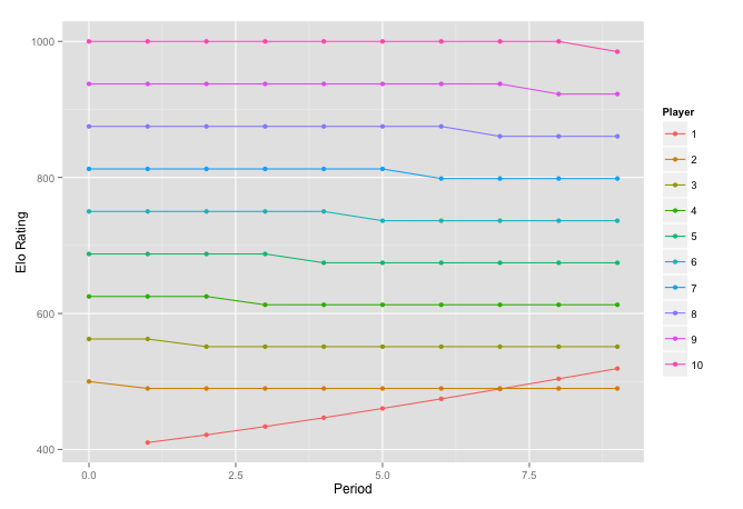
We can also speed the convergence process up. To do this we increase the value of k. This lets us see how the choice of k effects things.
new_rate <- elo_loop(data, rate, 'month', k = 64, complete = T)

ggplot(new_rate$rate, aes(x = per, y = rating, group = factor(id),
                          colour = factor(id))) +
  geom_line() + geom_point() + xlab('Period') +
  ylab('Elo Rating') + labs(colour = "Player")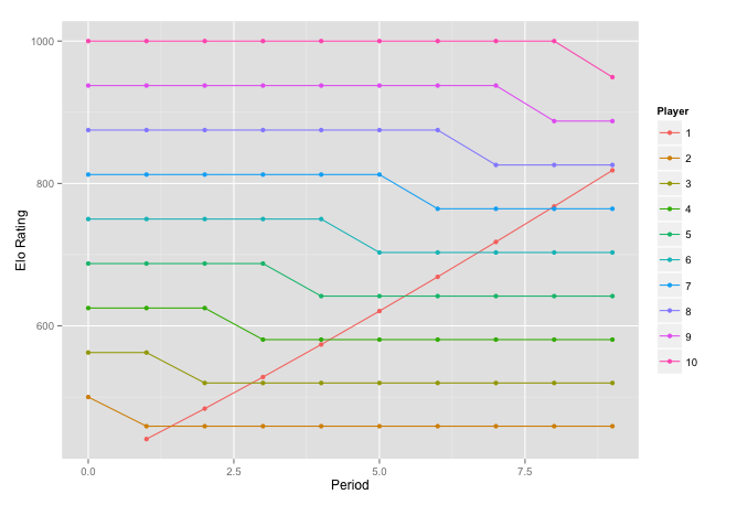
We can see the competitor moving up faster with each victory. If we were to reduce k he would move more slowly. We can also see one of the limitations of Elo here. It could be the case that Player 1 is simply getting better over time, he learns rather quickly and practices a lot. If that is the case everything here is fine. What is more likely though is that he was initially under-rated. Given that he is most likely extremely under-rated should Player 2 take a hit for losing to him? This seems like a hard thing to account for, at what point must you go back and update the score of Player 2? What if Player 2 has had other matches since, does his new score also need to propagate? I do not have the answers to these questions though.
Real Data
Lets try this out on some real data. This data is roughly 65,000 chess matches. For this data set we have the initial ratings for most players.
load('data/small_chess.RData')
load('data/initial_ratings.RData')

chess_stat <- elo_loop(small_chess, verbose = F, rate = init)$stat

ggplot(chess_stat[chess_stat$score != .5, ], aes(prob, fill = factor(score))) +
  geom_density(alpha = 0.2) + xlab('Win Probability') +
  ylab('Density') + labs(colour = "Result")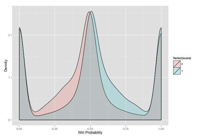
This plot may take a bit of explanation. It is a density of all of the matches split by whether white won or lost over the range of probability of winning. It attempts to show how white wins more when it has a higher probability of winning and loses more when the probability is lower. There are a few issues with it though. The first issue is related to the huge bulbs on the sides. We have a very poor initial value. All of the players in this dataset have very high Elo ratings, so a new player who takes the default value of 400 will have a large probability of losing. The side it impacts depends on whether the new player is white or black. The only logical decision here is to use the mean value of players in this cohort as the initial value. We can also see a slight difference in the peaks of each curve. This indicates that there is an advantage to one side. Since the wins are shifted to right it means that the white player has a slight advantage by going first. First lets tackle the initial value problem.
chess_stat <- elo_loop(small_chess, verbose = F, rate = init,
                 mx = mean(init$rating))$stat

ggplot(chess_stat[chess_stat$score != .5, ], aes(prob, fill = factor(score))) +
  geom_density(alpha = 0.2) + xlab('Win Probability') +
  ylab('Density') + labs(colour = "Result")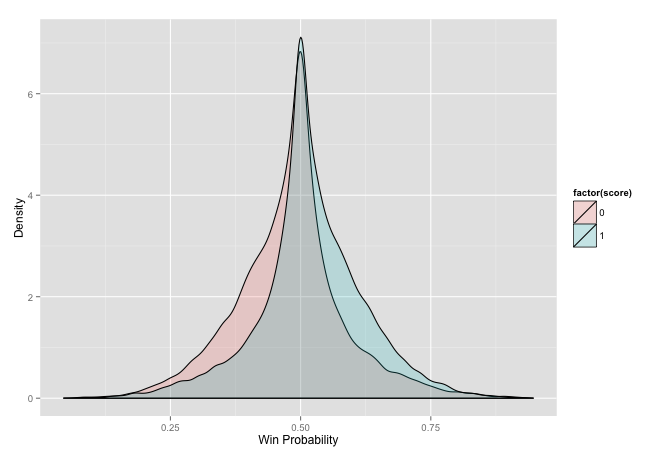
This seems to have fixed that issue. We can again see the difference in peaks at equal probability. We can see that the method seems to works as we have the region in between both curves. This is a little redundant though. To make this plot more intuitive we can flip the loses to the other side, always the view of the winner.
chess_stat_wl <- chess_stat[chess_stat$score != .5, ]
chess_stat_wl$p <- ifelse(chess_stat_wl$score == 1, chess_stat_wl$prob,
                          1 - chess_stat_wl$prob)

ggplot(chess_stat_wl, aes(p, fill = factor(1))) + geom_density(alpha = 0.2) +
  xlab('Win Probability') + ylab('Density')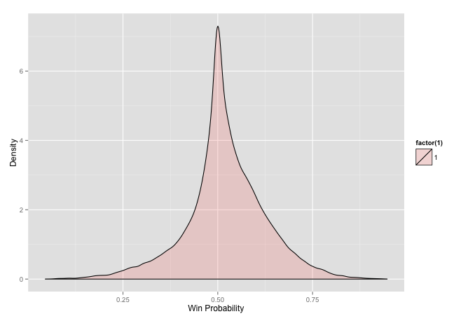
This plot shows some of the probabilistic impacts of competitions. Having a higher ranking does not guarantee victory it just means that there is a higher probability of it. We could see that in the last plot as the non-overlapping region.
Validation
Speaking of probability, now that we have some real data we should check some of the stats to make sure this really works. We can do this by looking at the probability of winning. If some score difference says that this should result in a win some percentage of the time, is the proportion that it actually happens?
head(chess_stat_wl)## score p new per prob d
## 57104 1 0.94672917 FALSE 97 0.9467292 500
## 13853 0 0.06621021 FALSE 27 0.9337898 460
## 55916 1 0.93096155 FALSE 96 0.9309616 452
## 13854 1 0.93063247 TRUE 27 0.9306325 451
## 18728 1 0.92889029 FALSE 41 0.9288903 446
## 6728 1 0.92839903 FALSE 13 0.9283990 445validate <- function(df, new = F) {
eval <- data.frame(mid = numeric(), mean = numeric(),
var = numeric(), cnt = numeric())
for (i in 10:90) {
up <- i / 100 + .02
low <- i / 100 - .02
if (new) {
obs <- df[df$prob > low & df$prob < up & !df$new, ]$score
} else {
obs <- df[df$prob > low & df$prob < up, ]$score
}
eval <- rbind(eval, data.frame(mid = i/100, mean = mean(obs),
var = var(obs), cnt = length(obs)))
}
eval
}
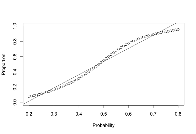
eval_chess <- validate(chess_stat)
plot(eval_chess$mid, eval_chess$mean, ylim = c(0, 1), ylab = 'Proportion', xlab = 'Probability')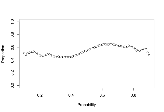
This looks pretty rough. We can put some error bars on this to make it easier to digest.
ggplot(eval_chess, aes(x = mid, y = mean)) +
  geom_errorbar(aes(ymin = mean-var, ymax = mean+var), colour = "black",
                width = .01, position = position_dodge(0.1)) +
  geom_point(size = 3, shape = 21, fill = "white") +
  scale_y_continuous(limits = c(0, 1))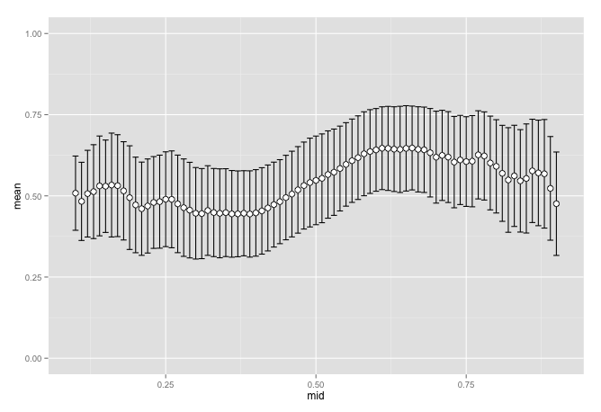
This looks pretty good in the region of .4 to .6 but falls apart outside of that. Things get a little chaotic as we get further from the middle. Does this have anything to do with new players who have no rating yet? Even though we removed the bulge on the edges we may still be quite far off. We can remove matches were one or both of the players have no initial rating and see if it helps smooth things out.
eval_no_rookie <- validate(chess_stat, T)

ggplot(eval_no_rookie, aes(x = mid, y = mean)) +
  geom_errorbar(aes(ymin = mean-var, ymax = mean+var), colour = "black",
                width = .01, position = position_dodge(0.1)) +
  geom_point(size = 3, shape = 21, fill = "white") +
  scale_y_continuous(limits = c(0, 1))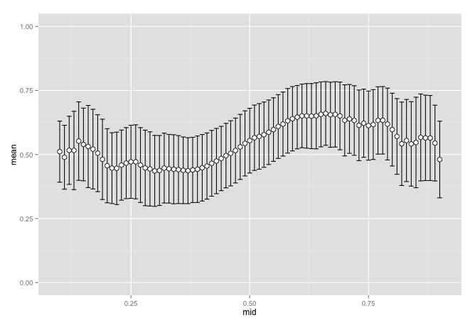
These look pretty similar but they are different. They are not different enough though to conclude that rookies are the cause. It had some impact but hard to tell how much. If we look closer at this data set we can see that we have very few observations in those areas.
eval_chess[eval_chess$mid %in% c(seq(.1, .2, .01), seq(.45, .55, .01),
                                 seq(.8, .9, .01)), c(1, 4) ]
## mid cnt
## 1 0.10 60
## 2 0.11 59
## 4 0.13 77
## 5 0.14 98
## 7 0.16 150
## 8 0.17 191
## 9 0.18 227
## 10 0.19 275
## 11 0.20 322
## 36 0.45 8065
## 37 0.46 9364
## 39 0.48 12052
## 40 0.49 15938
## 41 0.50 16261
## 42 0.51 15923
## 43 0.52 12122
## 44 0.53 10835
## 45 0.54 9442
## 46 0.55 8129
## 71 0.80 330
## 72 0.81 281
## 79 0.88 81
## 80 0.89 65
## 81 0.90 62Does this mean that it is just a matter of having to few observations? There is another data set that has more matches. This may help us to see if it is related to the size of the data as it is about 100 times larger. It does not have a set of initial rankings so I am going to use an educated guess.
load('data/big_chess.RData')

big_c <- elo_loop(big_chess, verbose = F, mx = 2100)

c_stat <- big_c$stat

ggplot(c_stat[c_stat$score != .5, ], aes(prob, fill = factor(score))) +
  geom_density(alpha = 0.2) + xlab('Win Probability') +
  ylab('Density') + labs(colour = "Result")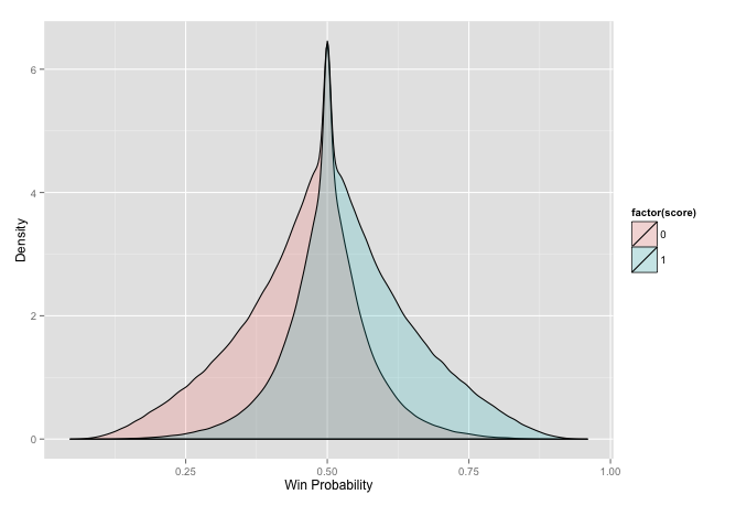
big_c_wl <- c_stat[c_stat$score != .5, ]
big_c_wl$p <- ifelse(big_c_wl$score == 1, big_c_wl$prob,
                           1 - big_c_wl$prob)

ggplot(big_c_wl, aes(p, fill = factor(1))) + geom_density(alpha = 0.2) +
  xlab('Win Probability') + ylab('Density') + labs(colour = "Result")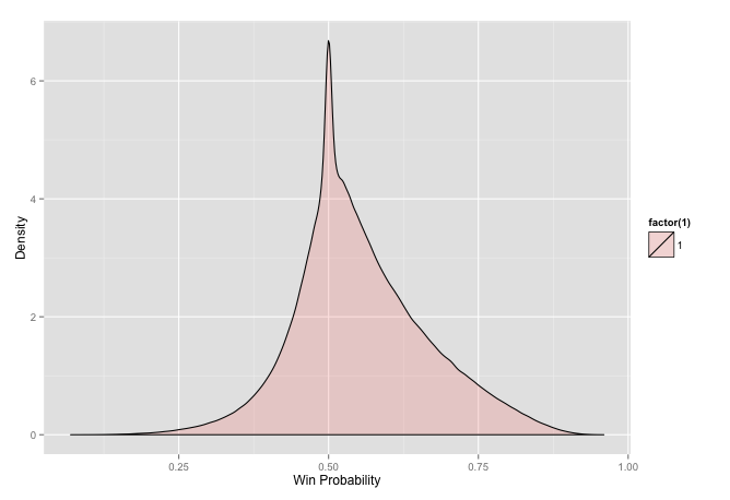
big_val <- validate(big_c_wl, T)

ggplot(big_val, aes(x = mid, y = mean)) +
  geom_errorbar(aes(ymin = mean-var, ymax = mean+var), colour = "black",
                width = .01, position = position_dodge(0.1)) +
  geom_point(size = 3, shape = 21, fill = "white") +
  scale_y_continuous(limits = c(0, 1)) + xlab('Win Probability') +
  ylab('Mean') + labs(colour = "Result")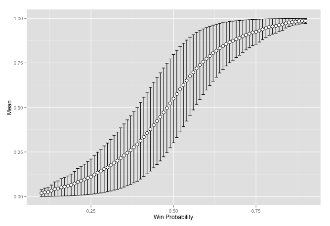
Having more data seems to clear up the chaos. There still seems to be something interesting happening as it is not a straight line though. Coming from an engineering background this looks very familiar. It reminds me of all of the places where we had nonlinear effects that we would linearize. Thus the result was linear around some point of interest but as we moved away from the region the results became unreliable.
lin <- big_val[big_val$mid <= .6 & big_val$mid >= .4, ]

plot(lin$mid, lin$mean, ylim = c(0, 1), ylab = 'Proportion', xlab = 'Probability')
reg <- lm(lin$mean ~ lin$mid)
abline(a = reg$coefficients[1], b = reg$coefficients[2])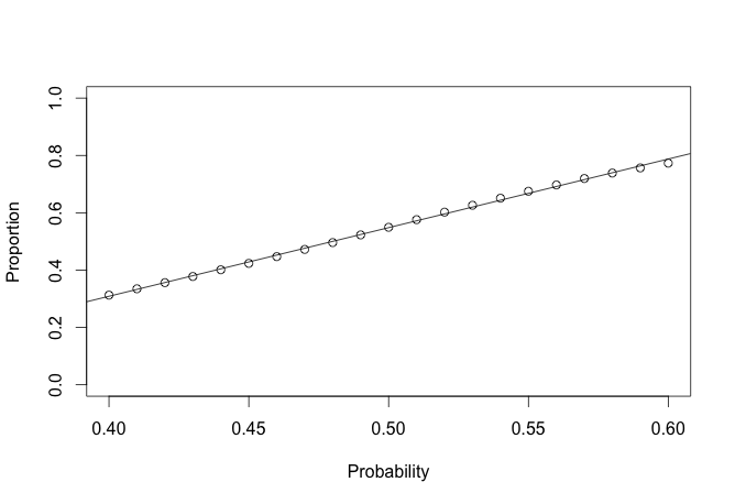
lin <- big_val[big_val$mid <= .8 & big_val$mid >= .2, ]

plot(lin$mid, lin$mean, ylim = c(0, 1), ylab = 'Proportion', xlab = 'Probability')
reg <- lm(lin$mean ~ lin$mid)
abline(a = reg$coefficients[1], b = reg$coefficients[2])
In the area around .5 it seems to be linear.
Once we go out of this region it becomes a bit more nonlinear. After some thought I am not sure how to account for this in the method itself.
I have read that there is an advantage to going first. We have seen some hints of this above. Some research points to it being equivalent to white getting 35 points added to their Elo. We should be able to validate this, even though neither source tells the exact method they used to get the final number.
mean(c_stat$score)## [1] 0.5347612This should be .5 if white receives no advantage in going first.
table(c_stat$score)##
## 0 0.5 1
## 737598 690661 899424One thing that must be checked is the assumption that the Elo differential in a match is 0.
mean(c_stat$d)## [1] 0.9795277It is not zero, but it is fairly close. It is closer than the reference observed. This means that in general the white player is stronger coming into a match.
mean(c_stat[c_stat$score == 1, ]$prob) - mean(c_stat[c_stat$score == 0, ]$prob)## [1] 0.107389t.test(c_stat[c_stat$score == 1, ]$prob, c_stat[c_stat$score == 0, ]$prob)##
## Welch Two Sample t-test
##
## data: c_stat[c_stat$score == 1, ]$prob and c_stat[c_stat$score == 0, ]$prob
## t = 619.8306, df = 1576869, p-value < 2.2e-16
## alternative hypothesis: true difference in means is not equal to 0
## 95 percent confidence interval:
## 0.1070494 0.1077285
## sample estimates:
## mean of x mean of y
## 0.5526679 0.4452789There is a valid difference in the probability.This is the advantage that white has in moving first. We can look for a value that matches this probability and see what is the point difference.
head(c_stat[c_stat$prob < mean(c_stat[c_stat$score == 1, ]$prob), ], 1)$d## [1] 37But we also need to remove the average white advantage, the difference that already exists.
head(c_stat[c_stat$prob < mean(c_stat[c_stat$score == 1, ]$prob), ], 1)$d - 2 * mean(c_stat$d)## [1] 35.04094We can also look at the plot of proportions of wins at each level of expected win.
x <- data.frame(d = numeric(), p = numeric(), r = numeric())
for (i in -400:400) {
  tmp <- c_stat[c_stat$d == i, ]
  tmp2 <- c(sum(tmp$score == 1), sum(tmp$score == 0), sum(tmp$score == .5))
  x <- rbind(x, data.frame(d = i, p = tmp2 / nrow(tmp), r = c(1, 0, .5)))
}


qplot(d, p, data = x, color = factor(r)) +
  ylab('Proportion') + xlab('Elo Difference') + labs(colour = "Result")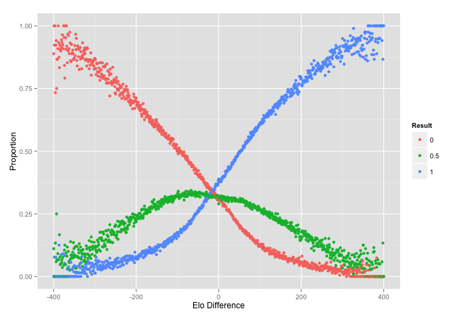
The intersection is around 16 to 18, about half of the advantage. It is a little hard to see from here though so we should zoom in.
qplot(d, p, data = x[x$d > -30 & x$d < 10, ], color = factor(r)) +
  ylab('Proportion') + xlab('Elo Difference') + labs(colour = "Result")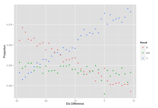
This seems to line up with other sources. We can now account for this advantage in the score. I am becoming more interested in how well this looks if we actually used it to predict the winner.
c_stat$pr <- round(c_stat$prob)
table(c_stat$pr, c_stat$score)
##
## 0 0.5 1
## 0 512622 370457 309029
## 1 224976 320204 590395c_stat$pr2 <- as.numeric(cut(c_stat$prob, seq(0, 1, .1))) / 10 - .05
table(c_stat$pr2, c_stat$score)##
## 0 0.5 1
## 0.05 542 31 13
## 0.15 18217 3225 987
## 0.25 63531 24387 8667
## 0.35 137601 84637 44950
## 0.45 292731 258177 254412
## 0.55 183202 226421 325610
## 0.65 34631 72389 167035
## 0.75 6461 19076 76261
## 0.85 676 2300 20825
## 0.95 6 18 664These tables show that the probability is pretty good at showing what we would guess for the outcome. There are plenty of other interesting aspects of what is happening here as well. We can see how the rankings settle, if you recall we did not know the initial ratings so everybody started at the same value.
rate <- big_c$rate

final <- rate[rev(!duplicated(rev(rate$id))), ]
final <- final[order(-final$rating), ]
hist(final$rating, main = "Distribution of Final Elo Rating",
     xlab = "Elo Rating")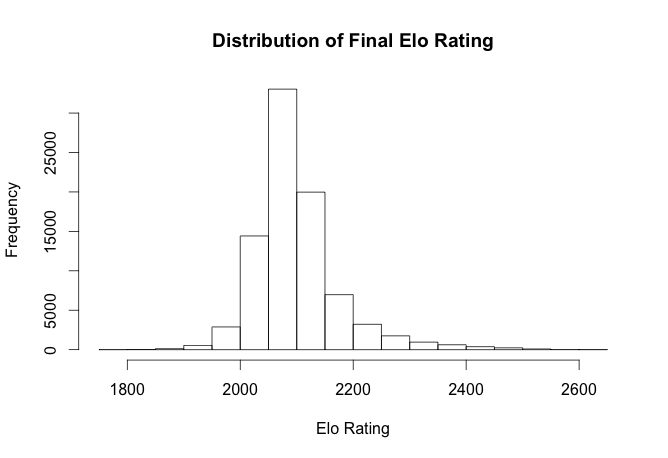
This does a great job of showing the current standings of all players. We can also se a pretty interesting plot of how players arrive at their ranking. Here are a handful of players and how each match moved them to were they currently stand.
x <- rate[rate$id %in% c(22144, 26816, 58624, 19532, 94825), ]

qplot(per, rating, data = x, color = factor(id)) + ylab('Elo Rating') +
  xlab('Time Period') + labs(colour = "Player ID")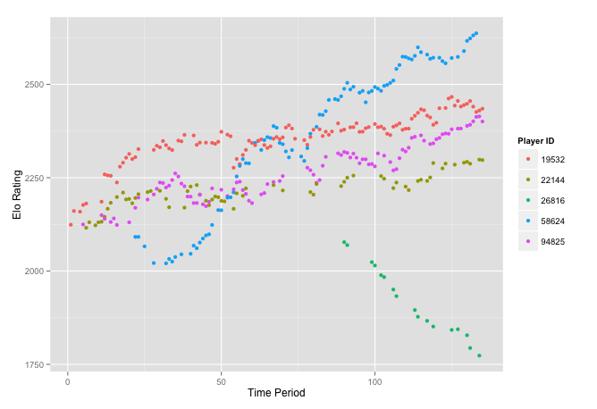
Other Domains
We should try this on some data other than chess. How about the MLB 2014 season.
load('data/mlb.RData')

mlb <- mlb_scores[mlb_scores$p == 'home', ]

mlb_stat <- elo_loop(mlb, verbose = F,  mx = 2100)$stat

ggplot(mlb_stat[mlb_stat$score != .5, ], aes(prob, fill = factor(score))) +
  geom_density(alpha = 0.2) + xlab('Win Probability') +
  ylab('Density') + labs(colour = "Result")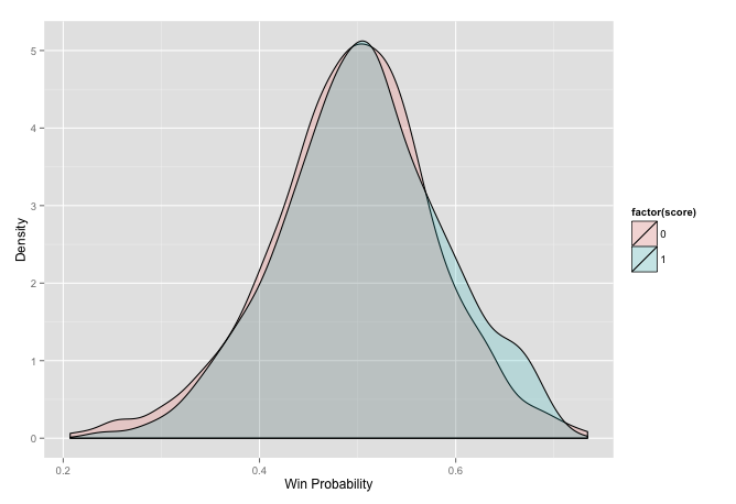
baseball <- validate(mlb_stat)

plot(baseball$mid, baseball$mean, ylim = c(0, 1), ylab = 'Proportion', xlab = 'Probability')
reg <- lm(baseball$mean ~ baseball$mid)
abline(a = reg$coefficients[1], b = reg$coefficients[2])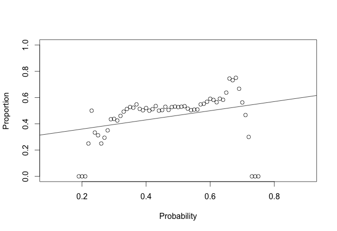
ggplot(baseball, aes(x = mid, y = mean)) +
  geom_errorbar(aes(ymin = mean - var, ymax = mean + var)) +
  geom_point(size = 3, shape = 21, fill = "white") +
  scale_y_continuous(limits = c(0, 1)) + xlab('Win Probability') +
  ylab('Mean') + labs(colour = "Result")
## Warning: Removed 24 rows containing missing values (geom_point).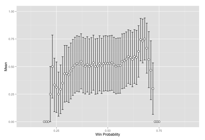
This does not seem to work so well for baseball games. What about MMA fights. One thing to note here is the bit of code that randomly shuffles the result. This is required because the set of data always has the winner as white. So there is no variance in the score. I am sure there is a way to get the information out without doing this but it has not yet come to me.
load('data/ufc.RData')

stat <- elo_loop(fights, verbose = F,  mx = 2100)$stat

stat$score <- sample(c(0, 1), nrow(stat), T)
stat$prob <- ifelse(stat$score == 0, 1 - stat$prob, stat$prob)
stat$d <- ifelse(stat$score == 0, -stat$d, stat$d)

ggplot(stat, aes(prob, fill = factor(score))) +
  geom_density(alpha = 0.2) +
  geom_density(alpha = 0.2) + xlab('Win Probability') +
  ylab('Density') + labs(colour = "Result")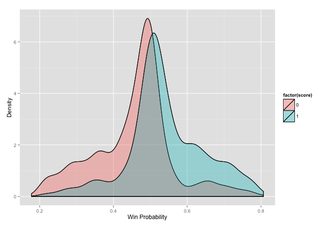
ufc <- validate(stat)

plot(ufc$mid, ufc$mean, ylim = c(0, 1), ylab = 'Proportion', xlab = 'Probability')
reg <- lm(ufc$mean ~ ufc$mid)
abline(a = reg$coefficients[1], b = reg$coefficients[2])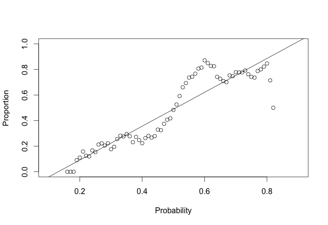
ggplot(ufc, aes(x = mid, y = mean)) +
  geom_errorbar(aes(ymin = mean - var, ymax = mean + var)) +
  geom_point(size = 3, shape = 21, fill = "white") +
  scale_y_continuous(limits = c(0, 1)) + xlab('Win Probability') +
  ylab('Mean') + labs(colour = "Result")
## Warning: Removed 14 rows containing missing values (geom_point).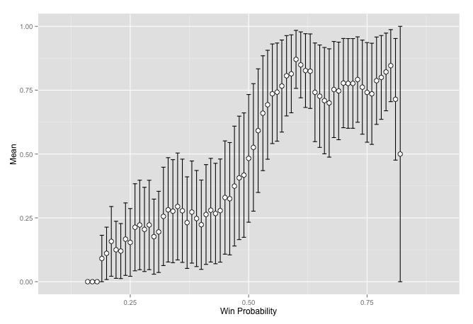
It seems to work better in this case. One thing that I started wondering about is that baseball has a lot more things happening, you have different pitchers so each match is not really the same team, you are on the road for various amounts of time meaning you might be worn out while playing a team you would normally beat, etc. There is also some element to getting into the playoffs, some teams may rest people for certain games, thus a lose may be strategic since a win against a team in the same division may be more important than an out-of-division game. I am just thinking through these and not making any accusations though. Nobody in baseball has ever won a majority of their games.
Conclusion
The Elo method seems to work. There may be better methods though that out-perform it. There may even be some that are better in some cases than others. I think I did satisfy my goal of learning more about Elo regardless of its applicability or strengths.
I have a few thoughts to try going forward if I revisit this. One revolves around the point system in baseball. There is still a win and a loss, but you can win by 1 or by 10 which are two very different things. They also try to resolve a draw in most cases. There is a distribution which maps to baseball pretty well, it is known as the Skellam Distribution. It makes a prediction of what the difference will be in the score, which is also a way of predicting the outcome, just use the sign. The distribution is really a random draw from the difference of two Poisson distributions, which would be each teams average score. I am interested in trying this on baseball. This only works though when all points scores are equal. This is not the case in places like basketball where you have two and three point field goals and free throws worth one point, football also has all sorts of different scores. There are things in MMA which are more than just win/loss but are more related to how you one, submission vs knockout. There is also a time component and it can even get down to voting if the time runs out. Not really sure how to quantify these into how much you won by, unless it is just votes, but that seems quasi-subjective. Is there a such thing in chess as to how large the margin of victory was in a given match? These would be interesting to investigate further!