Inspiration
Creating the app in my last post related to character networks got me thinking about some much older work I did related to movie data. This post focused on making things reproducible, but the underlying data was very interesting, the daily revenue of movies over time. There were interesting trends that could be seen in the temporal aspects of the data, it almost looked like a bouncing ball. There was a large revenue over the weekend followed by a slump throughout the week, only to repeat with lower amplitude in the coming week. I thought it would be interesting to look at this summer's movies. It is also a great place to use some of the visualization methods I have created recently as well as piecing them together to tell a story.
A First Glance
To start we should look at the date from a high level. We should expect to see hotspots over weekends when more people frequent theaters. The data used in this post can be obtained here.
library(devtools)
library(dplyr)

source_url("http://bit.ly/1CDycBV")

load("movie.rda")

movie %>%
  group_by(date) %>%
  summarise(sum = sum(daily)) %>%
  select(Date = date, value = sum) %>%
  ts %>%
  calheat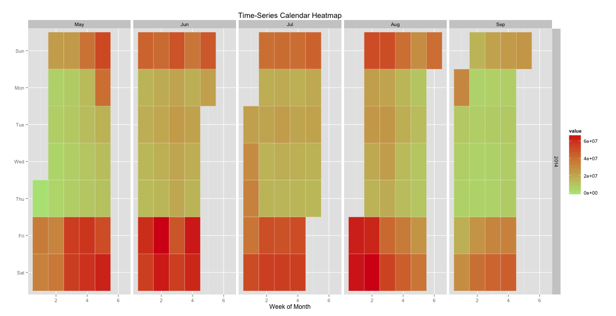
This is pretty close to what I expected. The one thing of interest is that there seems to be a gradual increase in weekdays leading up to July and then it starts to fall of again. There also seems to be some weekends that draw a larger crowd than others. What could be causing this, perhaps more or better movies in the middle of the summer? Maybe just lots of opening weekends at the same time.
How would we determine which movies are better and compare when they come out? We can calculate the total revenue from each movie to get the top earners.
movie %>%
  group_by(name) %>%
  summarise(sum = sum(daily)) %>%
  arrange(desc(sum)) %>%
  slice(c(1:10)) ->
  top_mv
## Source: local data frame [10 x 2]
##
##                                   name       sum
## 1              Guardians of the Galaxy 319169216
## 2      Transformers: Age of Extinction 245370666
## 3                           Maleficent 236412469
## 4           X-Men: Days of Future Past 233893992
## 5       Dawn of the Planet of the Apes 207604640
## 6             The Amazing Spider-Man 2 201911219
## 7                      Godzilla (2014) 200676069
## 8                       22 Jump Street 190849261
## 9  Teenage Mutant Ninja Turtles (2014) 187182309
## 10          How to Train Your Dragon 2 175859659
Now that we have a list of the top ten movies, we can use this list to filter our data.
movie %>%
  filter(name %in% top_mv$name) %>%
  group_by(date) %>%
  summarise(sum = sum(daily)) %>%
  select(Date = date, value = sum) %>%
  ts %>%
  calheat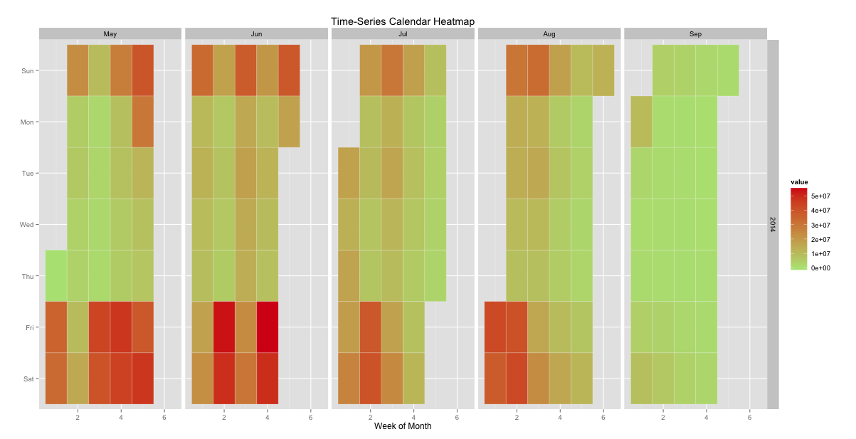
It appears that the better movies come out earlier in the summer. By mid August they are all out. There could still be more going on here though. We may need to look at each movie on its own and how it accumulates revenue through time.
Digging Deeper
To compare each movie we could create a calendar heatmap for each one, but that would be difficult to see everything all at once. How can we compare multiple revenue streams over time in only plot. One method from d3 that could shine some light on this is the stream graph. This plot type uses stacked areas in a continuous stream.
movie %>%
  filter(name %in% top_mv$name) %>%
  select(key = name, value = daily, date) %>%
  mutate(value = value / 1000000) %>%
  arrange(key, date) %>%
  write.csv(file = 'daily.csv', row.names = FALSE)

stream_plot('daily.csv', 'daily.html')
This is pretty cool. We can again see the bouncing ball type of phenomenon. We can also see how a movie comes on strong and then fades out as other movies are released. It also appears that there is a staggered release. Almost like races where people start at normal time intervals to stop them from stampeding over each other. There is a lot of noise here though. We could clean this up by aggregating away the daily fluctuations and get a weekly revenue.
weeks <- data.frame(date = as.Date("2014-05-02") + 0:146,
                    w = rep(1:21, each = 7))

movie %>%
  filter(name %in% top_mv$name) %>%
  inner_join(weeks, by = 'date') %>%
  arrange(name, date) %>%
  group_by(name, w) %>%
  summarise(sum = sum(daily), date = min(date)) %>%
  select(key = name, value = sum, date) %>%
  write.csv(file = 'weekly.csv', row.names = FALSE)

stream_plot('weekly.csv', 'weekly.html')
That cleans it up a lot. We can now see the pattern clearly. I am starting to wonder if there is some form of scheduled release. A way to give every movie there weekend in the spotlight. How could we determine if this is so?
Becoming Aesthetically Quantitative
The stream charts gave great insights into ebbs and flows. They also gave the insight of that there may be some systematic method to releasing movies but they do not offer much on the quantitative side. I was recently introduced to bump charts by a colleague, and gladly so because this is the exact area where they help. They allow us to see how rankings change over time. It makes it easy to see when things appear and when they rise and fall in the rankings. This is also a great place to try deploying something in Tableau. I am very excited to use Tableau now that they are available on Mac. creating this type of plot is a perfect fit.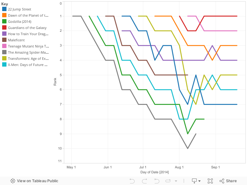
Here you can very clearly see how movies fade as newer releases come to theaters. It is quite uncommon for a moving to rise in the rankings. The norm is to fade out over time. There is very little trading places. For the most part a movie comes out and starts on top, as others come out they push older movies to lower and lower ranks until they eventually leave the theaters. This is probably not the case in general as this is only the top movies. I would imagine we would see soemthing that resembles a braid from all of the lower ranking movies.
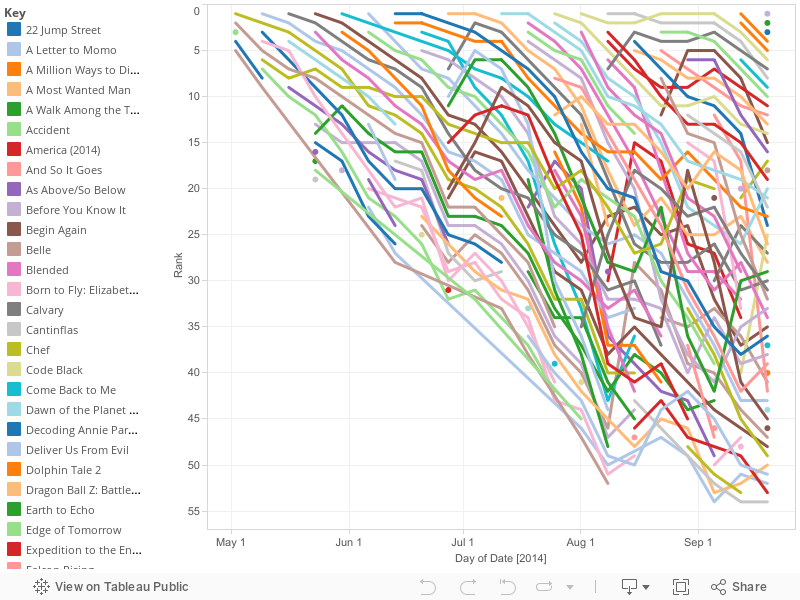
My thoughts were more or less true, it is very hard to understand what is happening here. There are too many crossing lines, and really just too many lines for this type of chart.
Conclusion
The main point I want to make here that this process of looking at a plot and seeing something or even not seeing something then restructuring the data and looking at differently is the heart of data science. There are lots of iterations on this: acquire, process, plot, interpret, clean, re-plot, etc. The end result can then be turned into a story. The story here was just that there seems to be some thought, even between Studios, about when they release movies.
Sometimes the results are astounding and sometimes just knowledge of minor details. More interesting things happen when the result is astounding. This is where the other part of data science can come in, building models. A studio could take knowledge like this and try to predict the optimal time to release a movie or how to space multiple films throughout the year. A theater could use this to determine when to retire a film and allocate more screens to a newer release. Anyone can take data and make plots. It takes more effort to interpret what the plot means and what question to ask next. Even more to condense this into a story that conveys some piece of information. It requires an actual problem and plenty of ingenuity to build a model from this knowledge and yet more work to take action and capitalize on it.