I have been playing with the data made available from the You can find the data Capital Bikeshare. This data is very interesting. It allows you to explore lots of different types of analysis. You can view the data as a network of bikes moving between stations. You can look at it from a network perspective or temporal or even spatial. I thought it would be interesting to explore some of these.
You can find the data here.
Flow
First lets look at the the flow of bikes from the perspective of a station. That is how do bikes flow through a given station. I thought it would be intersting to see if the network had pretty uniform flow, requiring know interventions. I did not expect this to be the case though.
require(lubridate)
require(devtools)
require(igraph)
require(XML)
require(dplyr)
require(googleVis)
require(ggplot2)
require(BreakoutDetection)
require(changepoint)

source_url('https://raw.githubusercontent.com/darrkj/home/gh-pages/rcode/recurBind.R')

bike <- read.csv('2014-Q2-Trips-History-Data.csv')

bike %>%
  select (Start.Station, End.Station) %>%
  count(Start.Station) %>%
  rename(Station = Start.Station, out = n) -> outFlow

bike %>%
  select (Start.Station, End.Station) %>%
  count(End.Station) %>%
  rename(Station = End.Station, inn = n) -> inFlow

inner_join(outFlow, inFlow, by = 'Station') %>%
  mutate(delta = inn - out) %>%
  select(Station, delta) %>%
  arrange(delta) %>%
  slice(c(1:5, (n() - 5):n()))
## Source: local data frame [11 x 2]
##
## Station delta
## 1 16th & Harvard St NW -3096
## 2 14th & Harvard St NW -1694
## 3 Columbia Rd & Belmont St NW -1514
## 4 39th & Calvert St NW / Stoddert -1386
## 5 Adams Mill & Columbia Rd NW -1298
## 6 Lynn & 19th St North 1301
## 7 15th & P St NW 1389
## 8 M St & Pennsylvania Ave NW 1518
## 9 C & O Canal & Wisconsin Ave NW 1754
## 10 Massachusetts Ave & Dupont Circle NW 2001
## 11 Georgetown Harbor / 30th St NW 2163We can see the stations that are most likely to accumulate bikes or always have a deficit. To get a better sense of what is happening I wanted to visualize this data. To play with this data and provide a method to interact with it, I thought an app would help. The app allows you to select stations and see how many trips move through each of these stations to each of the others. This seemed like a great place to use the chord diagram from d3.
So there can be an abundance at some locations, and others get depleted. I can imagine the stations I would most likely use would be my daily trips from Court House to Rosslyn. I would enjoy riding a bike from Court House to Rosslyn, all down hill, but back up the hill is another story. Bikes should accumulate at Rosslyn, but they could also be taken from Rosslyn into DC, so maybe they just get depleted from Court House, but they could still come in from other sources. This sounds like a network flow problem.
This also highlights that chord diagrams are much better for a smaller number of interactions, like passes between players in basketball. It also falls apart becuase we lose the ability to follow longer chains, a larger scale because is hard to hold in memory, your brain that is not RAM.
Connected Components
We need to either find a way to see the larger network flow or we need a way to find some smaller set of stations. In graph theory this would be a place to use community detection or connected components. They could provide smaller subsets that are more closely related than the rest of the stations. Another possible approach is to use the spatial information and partition some portion of the map via nearest neighbors. Or use one and see if the other validates it. I am going to try the connected components method.
bike %>%
  select(sdate = Start.date, sterm = Start.terminal,
         edate = End.date, eterm = End.terminal) %>%
  # Change timestamps to local time.
  mutate(sdate = force_tz(mdy_hm(sdate), 'EST'),
         edate = force_tz(mdy_hm(edate), 'EST')) %>%
  na.omit() %>%
  # Get the midpoint between the start and end times.
  transform(mid = sdate + floor((edate - sdate) / 2)) %>%
  select(sterm, eterm, mid) %>%
  mutate(sterm = as.character(sterm), eterm = as.character(eterm)) -> raw

# A point in time from the data
rand_day <- now() - months(5)

# Get a three day period
three_days <- unique(raw[raw$mid >= rand_day & raw$mid < rand_day + days(3), ])

# All of the sations in this data.
stations <- unique(c(three_days$sterm, three_days$eterm))

# The flow network over this three day window.
network <- graph.data.frame(three_days[, c('sterm', 'eterm')], vertices = stations)

# These are the communities each of the stations belong to.
stations <- data.frame(terminalName = stations,
                       cluster = clusters(network)$membership)

# How are the components set up
table(stations$cluster)
##
## 1 2 3 4 5
## 290 12 3 2 1This approach will gives us the strongly connected components over the timespan that was used. This means that if there is any way to reach a station from another station via a trip it will be part of the component. There is not a lot of separation but we do remove some groups that do not interact.
Mapping Stations
We can check what these look like by looking on a map. We first need the locations of the stations. We can find this by using the live XML data which has the latitude and longitude of each station.'http://www.capitalbikeshare.com/data/stations/bikeStations.xml' %>%
xmlToList() -> geo
# Transform it into a more usable structure.
geo <- plyr::ldply(geo[-length(geo)], function(x) data.frame(t(x)))
# Clean the data.
geo %>%
select(terminalName, lat, long) %>%
# Clean up odd list structures and characters
transform(terminalName = unlist(terminalName), lat = as.numeric(unlist(lat)),
long = as.numeric(unlist(long))) %>%
inner_join(stations, by = 'terminalName') %>%
na.omit() %>%
filter(cluster %in% c(1, 2)) -> stations
ggplot(stations, aes(long, lat)) + geom_point(aes(colour = factor(cluster)))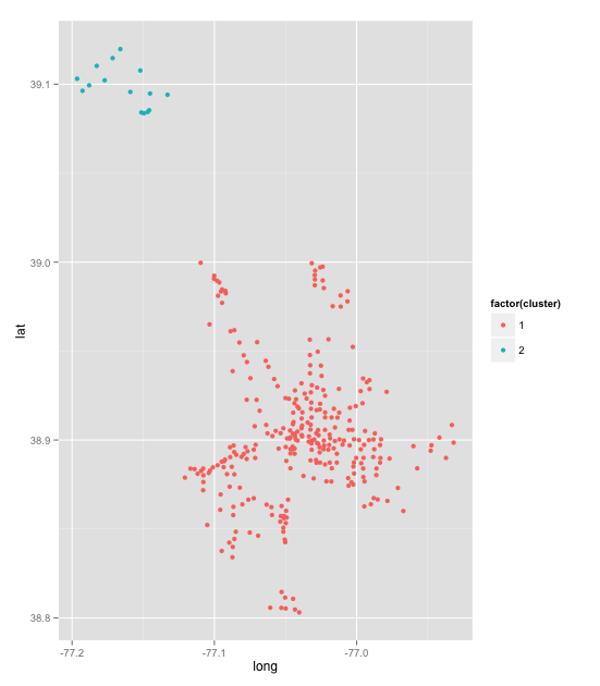
It is not really a map, but we can see that we have one group in the DC area and another in the Rockville area. This is a pretty good validation of thesearching for components. I would like to try some community detection for groups of stations that interact more than others. I may try this another time as I am more interested in how the network changes.
Below is a map, but I got to frustrated with map API to actually get the colors to appear correctly. If you hover over you can see cluster one and cluster two.
df <- stations
df$LatLong <- paste(df$lat, df$long, sep = ':')

m <- gvisMap(df, 'LatLong', 'cluster', options = list(showTip = T,
             showLine = F, enableScrollWheel = T))
plot(m)
Network Change Detection
For moving forward we should only consider the larger community, the DC area. Can we look at how things change over time? How do we measure things changing in the network.
net_params <- function(g) {
data.frame(
  size = ecount(g)
  average_path_length = average.path.length(g, unconnected = F),
  clique = suppressWarnings(clique.number(g)),
  reciprocity = reciprocity(g)
}

# How to cut the dataset to a region of time
t1 <- mdy_hms("4-1-2014-4-0-0", tz = 'EST')

# Function get prep data and call function.
calc <- function(x, diff = 1) {
  raw %>% filter(mid >= x & mid < x + hours(diff)) %>%
    select(eterm, sterm) %>%
    graph.data.frame(vertices = unique(c(raw$sterm, raw$eterm))) %>%
    net_params() %>%
    cbind(date = x)
}

graph_change <- recurBind(lapply(t1 + hours(0:2180), calc))[[1]]
g <- graph_change[1:200, ]

par(mfrow = c(2, 2))
plot(g$date, g$size, 'l', main = 'Size')
plot(g$date, g$average_path_length, 'l', main = 'Avg Path Length')
plot(g$date, g$clique, 'l', main = 'Max Clique')
plot(g$date, g$reciprocity, main = 'Reciprocity')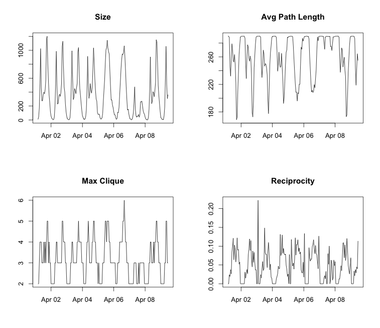
Something interesting here is that there is a pretty consistent routine through the week. There are lots commutes through the week in the morning and evening, peoples work travel. On the other hand there is only one spike on the weekends, and that occurs around lunch time. There is also a fluke in the data. You can see that that April 7, 2014 was very different than the days around it. I looked back at the weather for that day, it was 15 degrees colder than the day before and after, and it also rained about half an inch. Very interesting, you can see the weather in the deviation of communication throughout the network.
This was also a little different than what I had expected. I thought that the parameters would be less volatile than this. I want to try to see some slower evolving time series. In order to do this I should shrink the time change parameter from an hour to a minute.
graph_change_m <- recurBind(lapply(t1 + minutes(0:4000), calc))[[1]]

g <- graph_change_m[1:4000, ]

par(mfrow = c(2, 2))
plot(g$date, g$size, 'l', main = 'Size')
plot(g$date, g$average_path_length, 'l', main = 'Avg Path Length')
plot(g$date, g$clique, 'l', main = 'Max Clique')
plot(g$date, g$reciprocity, 'l', main = 'Reciprocity')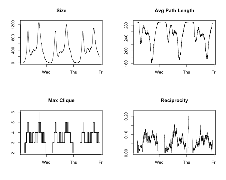
par(mfrow = c(1, 1))
plot(graph_change_m$date[1:4000], graph_change_m$average_path_length[1:4000],
     'l', xlab = 'Time', ylab = 'Avg Path Length',
     main = 'Avg Path Length Over time')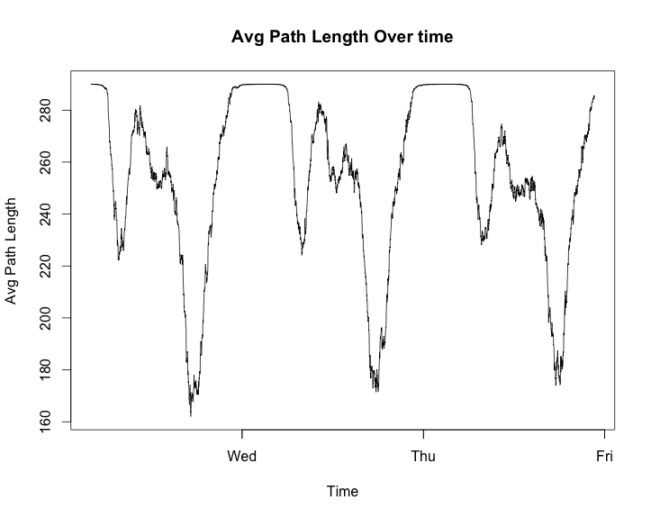
These look to have some very strong patterns. The package I have heard of most for analysing when thing change in a time series is changepoint. For an interesting example usage you can see this site where it is used to analysis how the popularity of The Simpsons televsion show decresead in popularity.
g <- graph_change_m[1:1400, ]

cp_size <- cpt.meanvar(g$size, test.stat = 'Gamma', method = 'BinSeg', Q = 15)
plot(cp_size, cpt.width = 3, ylab = 'Network Size',
     main = 'Changepoints in Network Size'))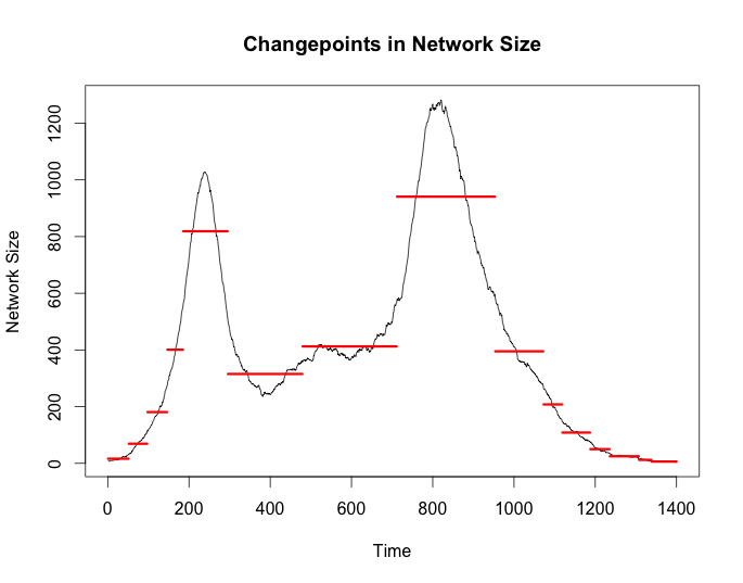
cp_apl <- cpt.meanvar(g$average_path_length, test.stat = 'Normal',
                      method = 'BinSeg', Q = 25)
plot(cp_apl, cpt.width = 3, ylab = 'Avg Path Length',
     main = 'Changepoints in Average Path Length')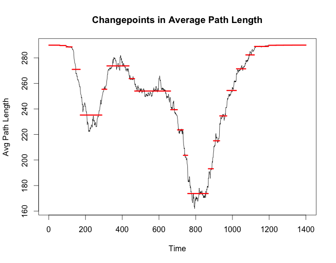
cp_rec <- cpt.meanvar(g$reciprocity, test.stat = 'Normal',
                      method = 'BinSeg', Q = 25)
plot(cp_rec, cpt.width = 3, ylab = 'Reciprocity',
     main = 'Changepoints in Reciprocity')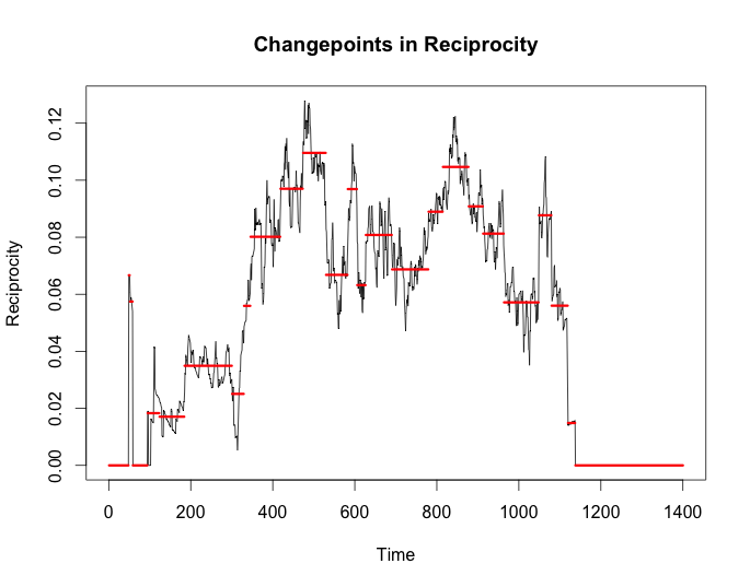
I wanted to use the changepoint package just as a benchmark to compare against the new Twitter breakoutDetection package. There have been other posts of people talking about it lately as well. I am just going to place the times from breakout on the plot from changepoint to see how they stack up.
bd_apl <- breakout(g$average_path_length, method = 'multi', plot = TRUE)
plot(cp_size, cpt.width = 3, ylab = 'Network Size',
     main = 'Changepoints in Network Size')
abline(v = bd_size$loc)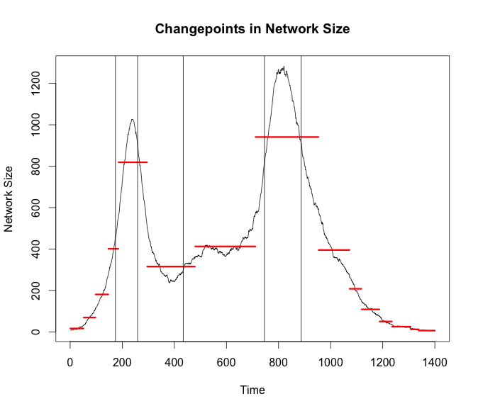
bd_size <- breakout(g$size, method = 'multi', plot = TRUE)
plot(cp_apl,cpt.width = 3, ylab = 'Avg Path Length',
     main = 'Changepoints in Average Path Length')
abline(v = bd_apl$loc)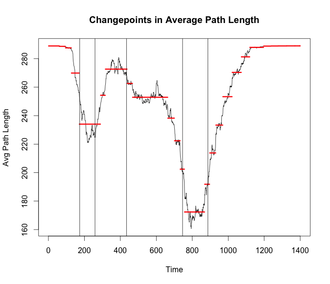
bd_rec <- breakout(g$reciprocity, method = 'multi', plot = TRUE)
plot(cp_rec,cpt.width = 3, ylab = 'Reciprocity',
     main = 'Changepoints in Reciprocity')
abline(v = bd_rec$loc)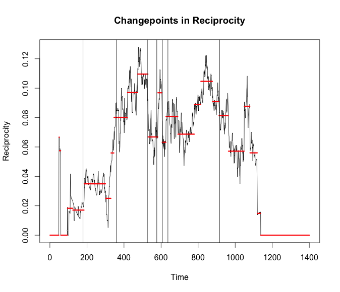
Conclusion
What does all of this mean? Most of the changepoints from both algorithms seem to occur when there is the highest variance for some span of time. My next thought would be to try and increase the timespan. Not look for changes throughout a day but changes at a higher level. Similar to seeing the odd day where it was cold and rainy. It would be interesting to see if these packages could pick up the day a new station is opened after some finer grain community detection is done.